

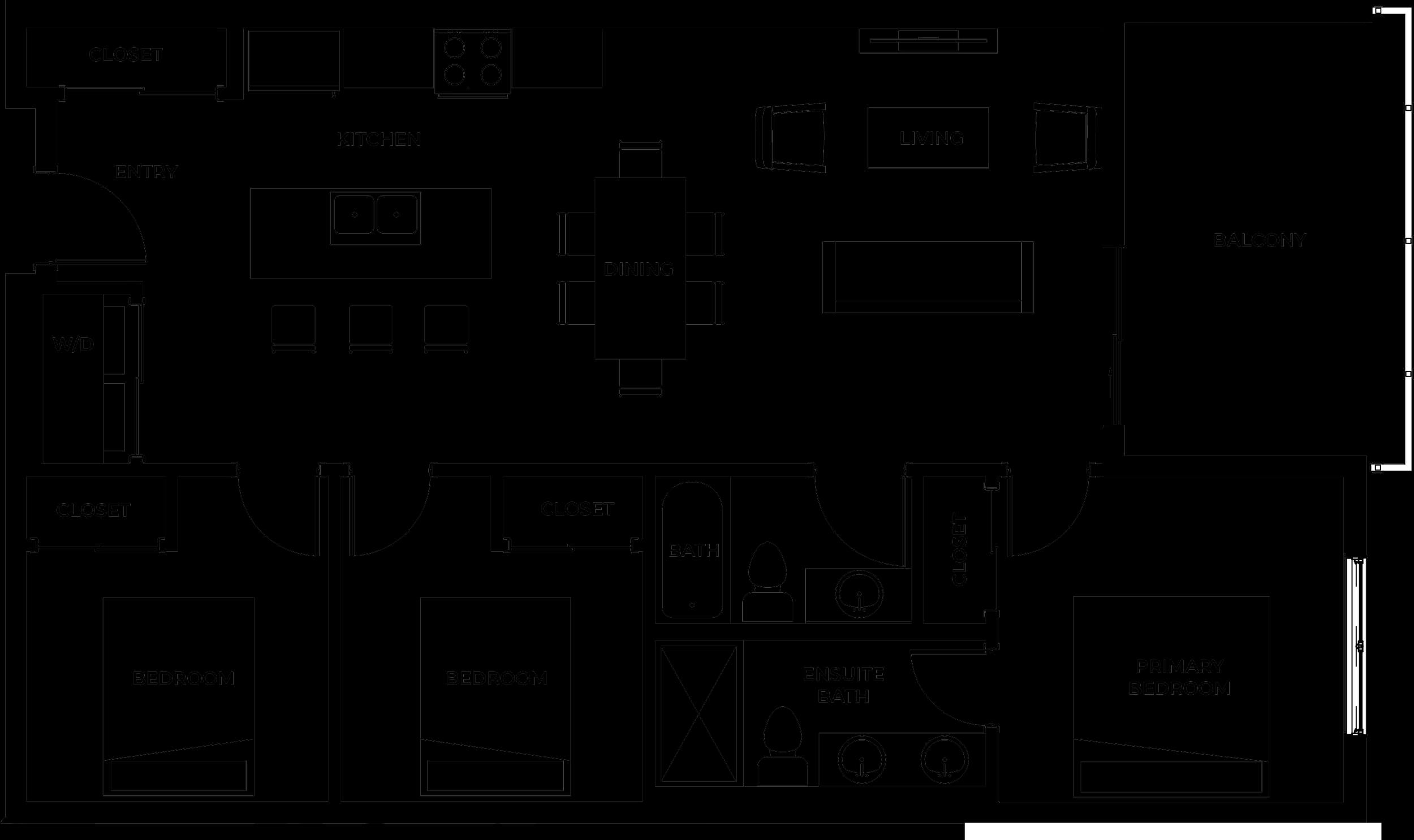
Floor Plans & Amenities
How to Compare Condo Floor Plans: A Guide for Kelowna Buyers
Two condos with the same square footage can live very differently. This guide shows what to check on a plan, and lets you compare real ones.
Read the guide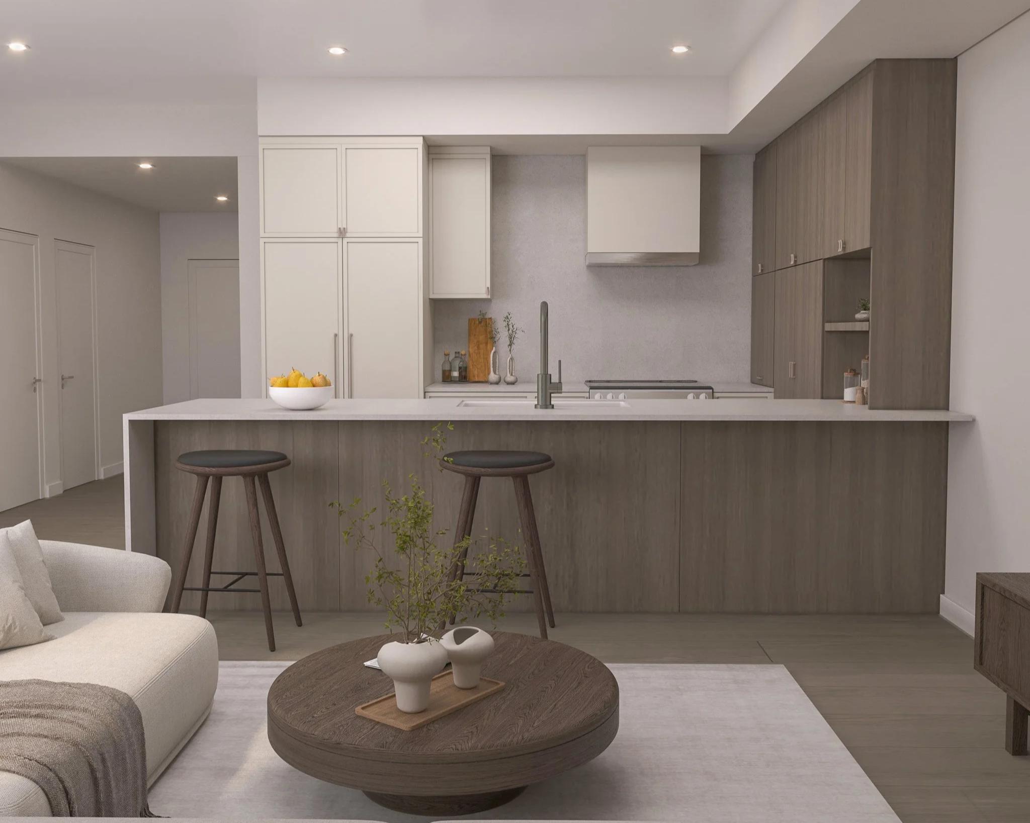
Both palettes come from Hatch Interior Design and sit on one finish schedule. What changes is colour and tone, which is easier to judge with a few questions in hand.
Floor Plans & Amenities4 min read
By the Serenity team. Published , checked .
Most useful for: Downsizers, First-time buyers.
Light or dark condo finishes is one of the first questions a Kelowna presale buyer meets, and at Serenity the renderings show two palettes by Hatch Interior Design.
This guide puts both palettes side by side, separates what changes from what the finish schedule lists for every home, and ends with the questions that settle it. Everything here comes from the renderings, the finish schedule and the appliance list. Whether buyers choose a palette, and which homes get which, has not been published.
Choosing light or dark condo finishes in Kelowna at Serenity comes down to colour and tone. The published finish schedule lists one set of materials, not one per palette. Light is soft ivory and warm sand, with natural wood tones throughout; Dark is deep charcoal and rich walnut, with matte black accents. Weigh the daylight a home gets, the furniture you are bringing and how each palette looks in person.
From Serenity's finish schedule and appliance list on the interiors page. All images are concept renderings.
The Light palette is soft ivory and warm sand, with natural wood tones throughout. The Dark palette is deep charcoal and rich walnut, with matte black accents. Choose a room to see each palette's version of it.
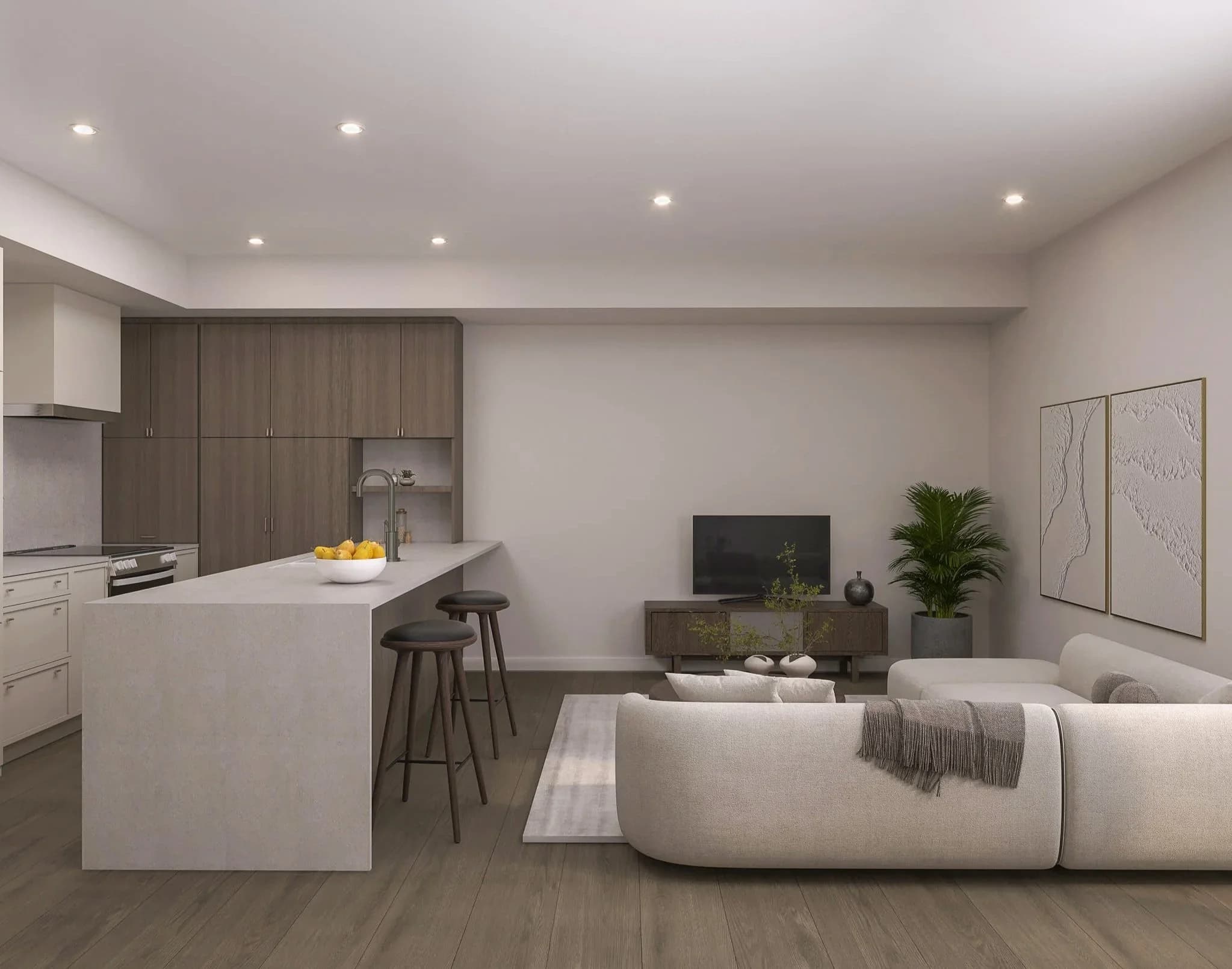
The two kitchen renderings are different rooms, drawn from different angles, so compare the colours and the mood rather than the layout.
Serenity's two interior palettes by Hatch Interior Design. Choose a room to compare.
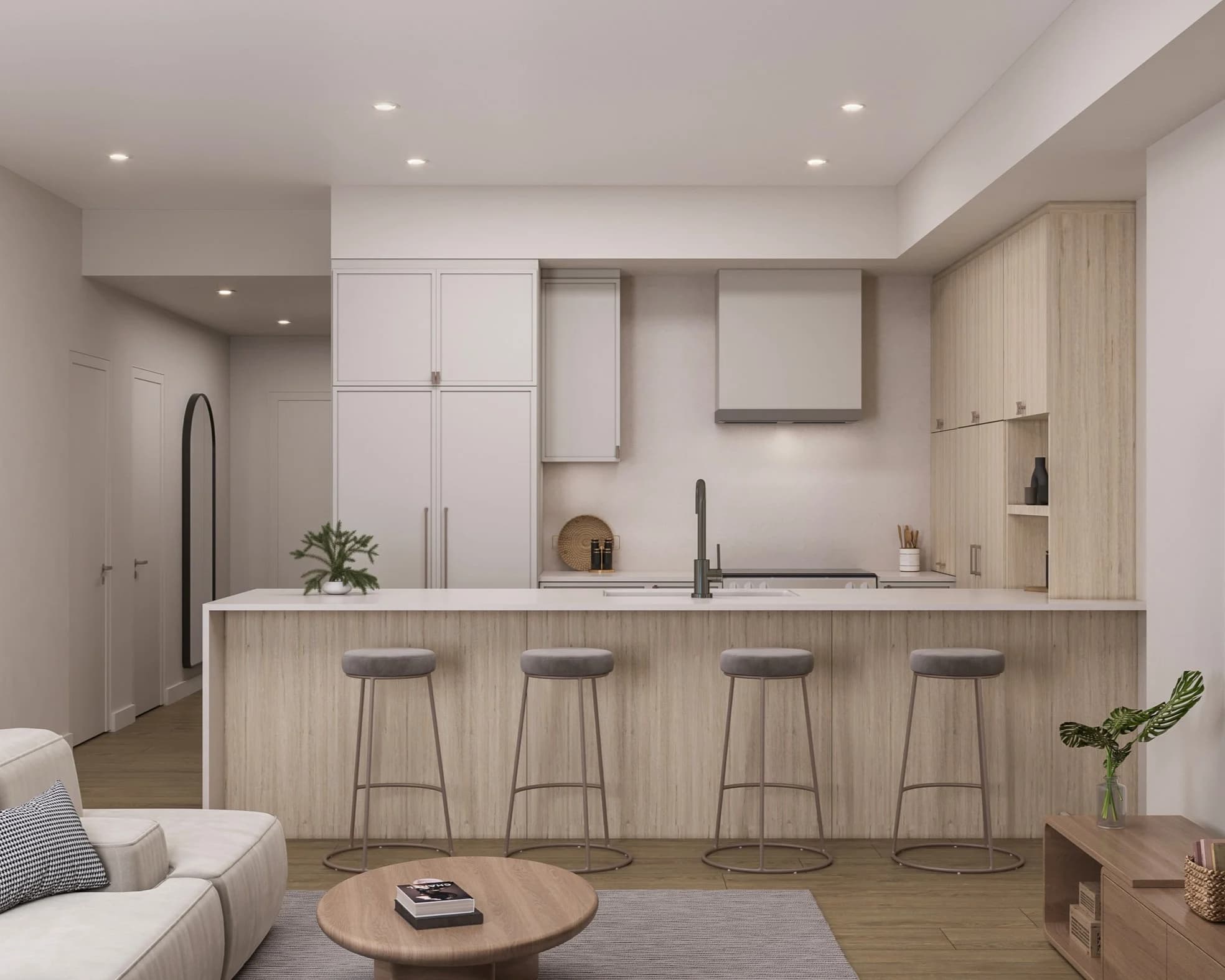
Concept renderings; finishes are subject to change. Every room in both palettes is on the interiors page.
Colour and tone. Both kitchen renderings pair white upper cabinets with wood-tone lower and tall cabinets. In Light the wood is pale and warm, softening the room's edges and making the daylight seem to carry further. In Dark, deep walnut gives the island and tall cabinets more visual weight and sets off the white quartz and pale walls.
Light keeps the attention on the room and the furnishings you bring into it; Dark gives the joinery a stronger presence. That is the trade to weigh.
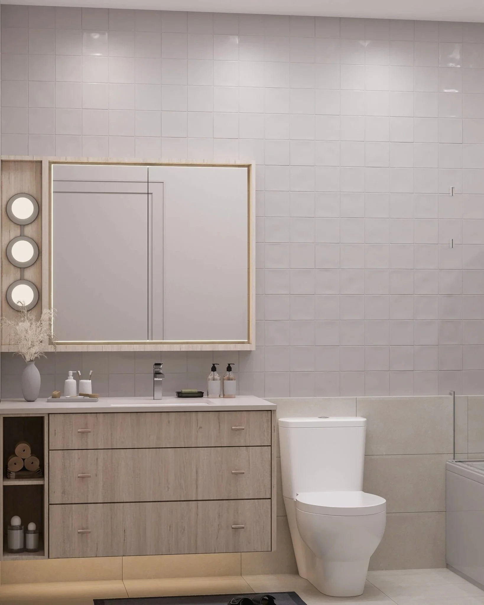
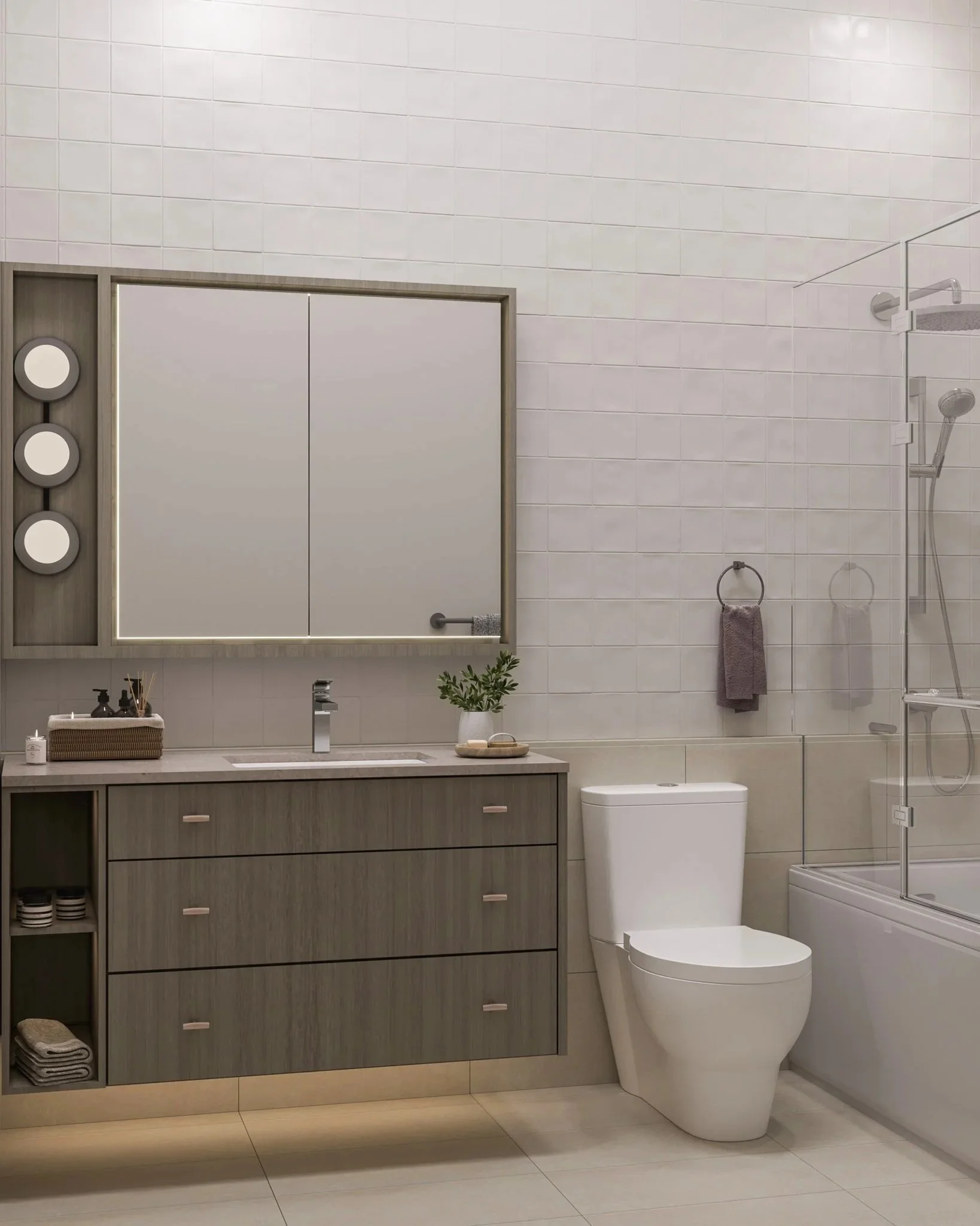
The two bathroom renderings are drawn from almost the same position, so they are the easiest pair to compare. The layout, the white wall tile, the toilet and the lit mirror cabinet look the same in both.
What changes is the wood tone and the look of the countertop. In Light the floating vanity, the mirror frame and the open shelf are a pale oak tone over a light countertop. In Dark they are a grey-brown walnut tone, and the countertop looks darker. If you prefer one bathroom, use that as a guide: the renderings show the same shift in colour elsewhere in the home.
Serenity's published finish schedule lists one set of materials. Ask the sales team to confirm whether any finish differs by palette.
Paint makers rate colours by light reflectance value, on a scale from 0, which absorbs all light, to 100, which reflects all of it. Paler surfaces sit higher on that scale and send more of the light they receive back into the room; darker ones absorb more of it.
So the same palette reads differently in two homes. A home that gets strong daylight can carry the Dark palette without feeling closed in, while a home with less daylight will look brighter in Light. Serenity has not published the orientation of each home, so ask which way the home you are considering faces before you decide.
Work through these with the plan you are considering in front of you.
Renderings are a guide to tone, not a colour match: screens and lighting change how they look. Ask the sales team how to see the finishes in person, or request a private presentation of the plans and palettes.
Serenity has not published whether buyers can choose a palette, or which palettes are offered for each home. Ask the sales team before you sign, and get the answer in writing with the date by which the choice has to be made.
The appliance list is not split by palette. It names Fisher & Paykel, Broan, Panasonic and Electrolux. The refrigerator and dishwasher sit behind cabinet panels and the microwave is built in, so the kitchen's cabinetry carries the palette rather than the appliances.
Paler surfaces reflect more of the light they receive, which is what a paint's light reflectance value measures, so the Light palette will usually make a room with limited daylight look brighter. How much daylight a home gets matters as much as the palette, so ask which way the home faces.
No. Every image is a concept rendering and finishes are subject to change. Use the renderings to judge tone and mood, and ask to see physical samples of the cabinetry, quartz and flooring before you decide.
General information read from these sources on the date above, not legal, tax or financial advice.
Related Guides
Two condos with the same square footage can live very differently. This guide shows what to check on a plan, and lets you compare real ones.
Read the guide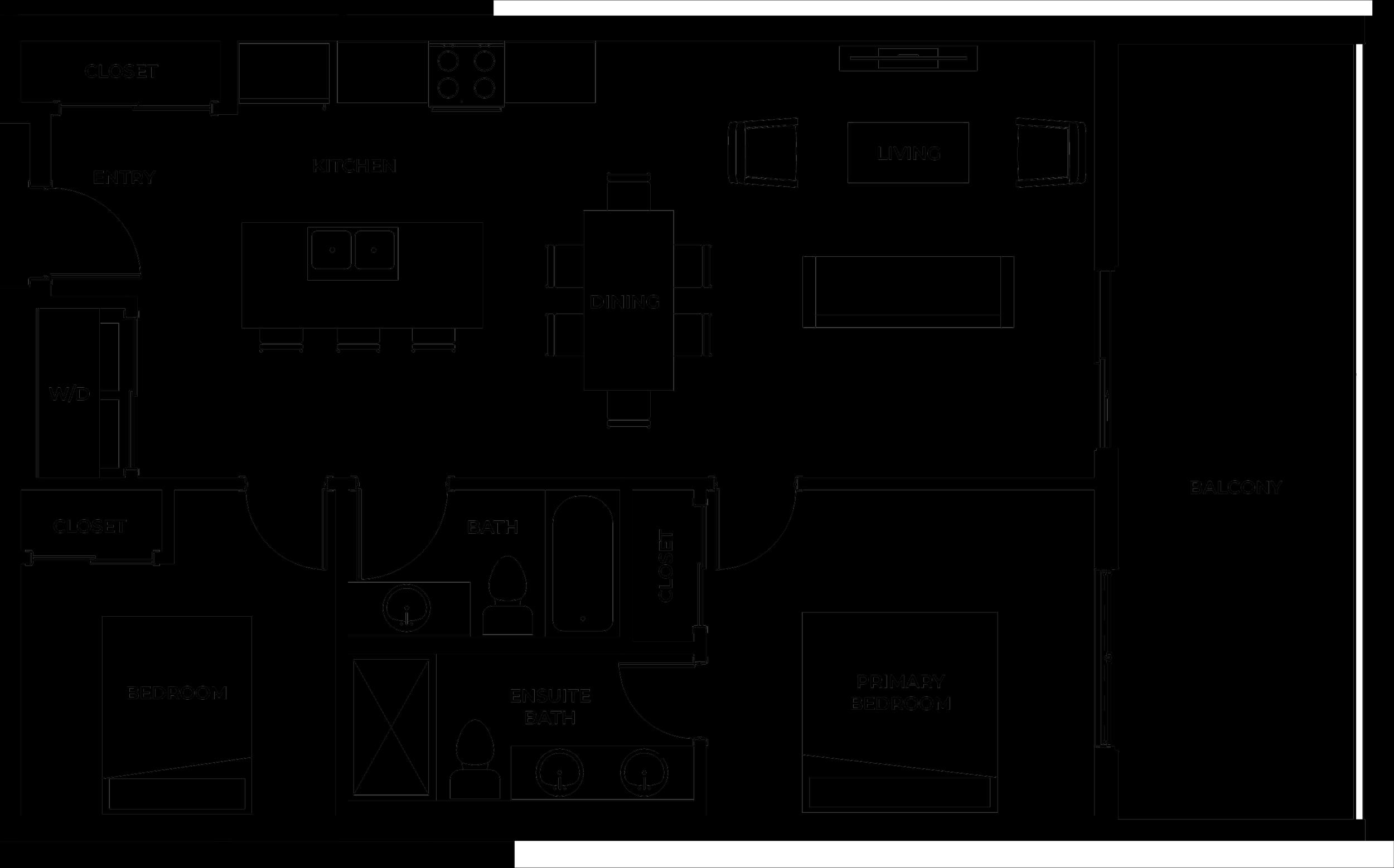
A published range from real plans, with the arithmetic to judge any 2 bedroom condo you are shown.
Read the guideA presentation is part tour and part pitch. A short list keeps you on facts, and these are the ones worth bringing.
Read the guide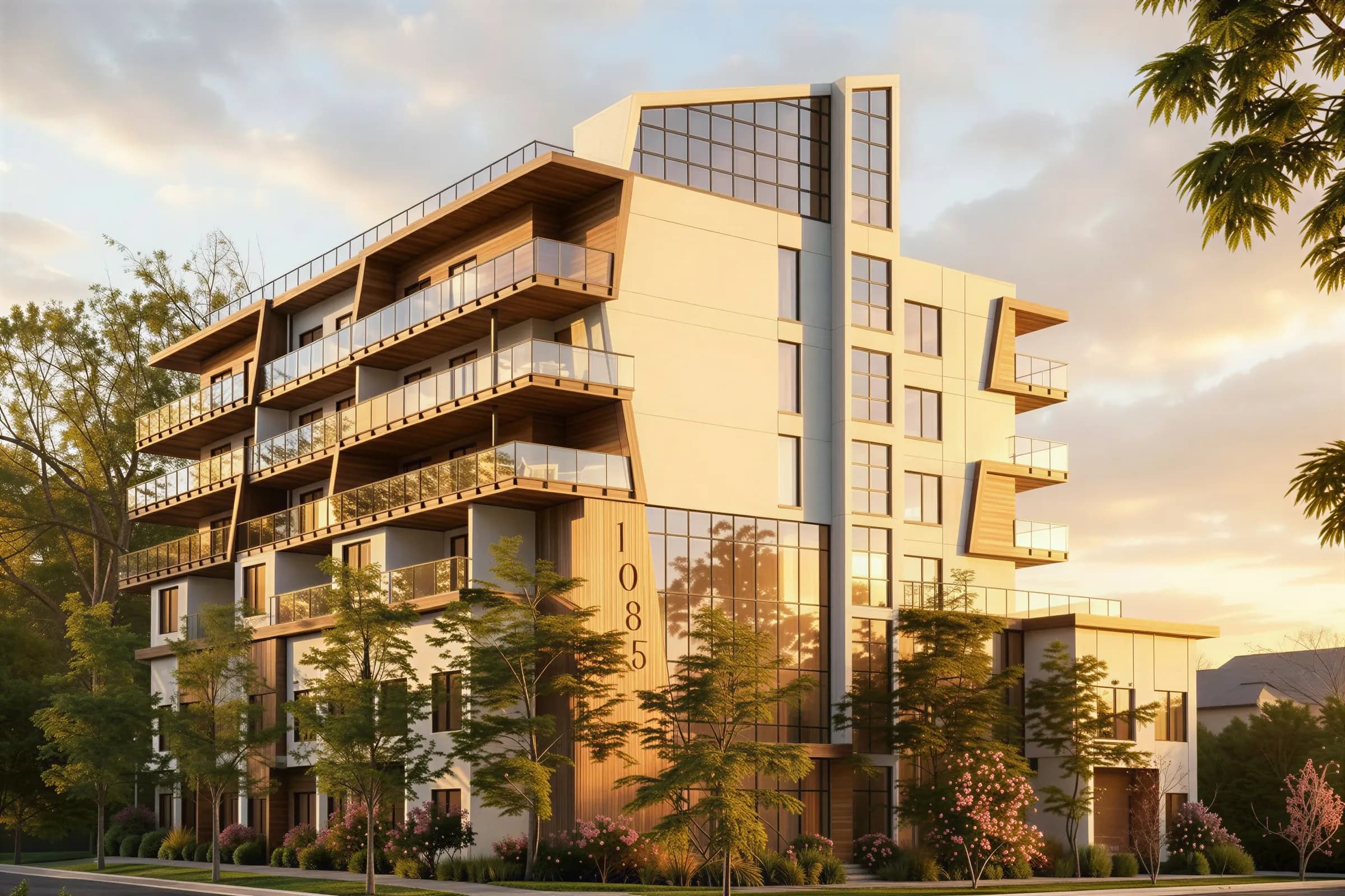
The size of a building decides how many neighbours share each vote, each repair and each amenity. Here is what that looks like at 33 homes, under BC's strata rules.
Read the guide